# Tailwind CSS คืออะไร? คู่มือเริ่มต้นใช้งาน Tailwind CSS ใน Next.js สำหรับนักพัฒนา SME ปี 2026
ในยุคที่การพัฒนาเว็บแอปพลิเคชันต้องการความรวดเร็วและความสวยงาม นักพัฒนาหลายคนยังคงเสียเวลาไปกับการเขียน CSS แบบ Custom ที่ซ้ำซ้อน ทำให้โปรเจกต์ล่าช้าและยากต่อการดูแลรักษา
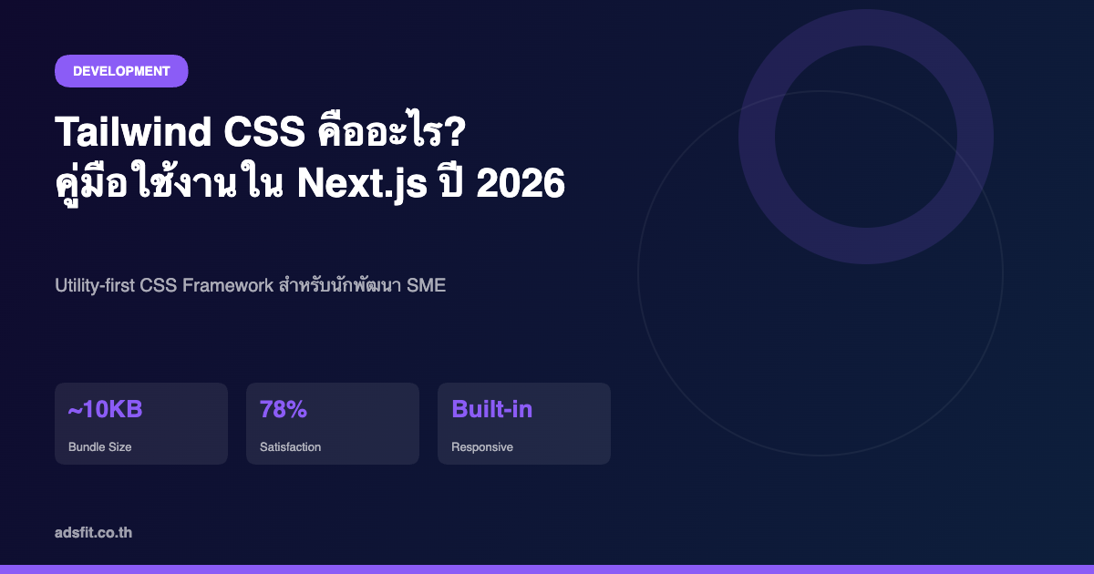
Tailwind CSS คือ Utility-first CSS Framework ที่เปลี่ยนวิธีการเขียน CSS ไปอย่างสิ้นเชิง แทนที่จะเขียน CSS Class แบบ Semantic เช่น `.card` หรือ `.button` คุณจะใช้ Class ขนาดเล็กที่มีหน้าที่เฉพาะเจาะจง เช่น `flex`, `pt-4`, `text-center`, `bg-blue-500` ประกอบกันเพื่อสร้าง UI ที่ต้องการ
บทความนี้จะพาคุณเรียนรู้ Tailwind CSS ตั้งแต่แนวคิดพื้นฐาน การติดตั้ง ไปจนถึงการสร้าง Component จริงใน Next.js พร้อมตัวอย่างที่นำไปใช้งานได้ทันที
Tailwind CSS คืออะไร และทำไมถึงเป็นที่นิยม
Tailwind CSS เป็น CSS Framework แบบ Utility-first ที่พัฒนาโดย Adam Wathan และทีมงาน Tailwind Labs ความแตกต่างหลักจาก Framework อื่นอย่าง Bootstrap หรือ Bulma คือ Tailwind ไม่มี Pre-built Component สำเร็จรูป แต่ให้ Utility Class นับพันรายการที่คุณนำมาประกอบกันเองตามต้องการ
ข้อดีที่ทำให้ Tailwind ได้รับความนิยมสูงในปี 2026:
ตามสถิติจาก State of CSS Survey 2025 Tailwind CSS มีคะแนนความพึงพอใจสูงถึง 78% และถูกใช้ในองค์กรขนาดต่างๆ ทั่วโลก
การติดตั้ง Tailwind CSS ใน Next.js 15
การเริ่มต้นโปรเจกต์ใหม่ด้วย Next.js 15 และ Tailwind CSS นั้นง่ายมาก เพราะ Next.js รองรับ Tailwind CSS แบบ Built-in แล้ว
ขั้นตอนที่ 1: สร้างโปรเจกต์ Next.js ใหม่
```bash
npx create-next-app@latest my-project --typescript --tailwind --eslint
```
เมื่อใช้ Flag `--tailwind` ระบบจะติดตั้งและตั้งค่า Tailwind CSS ให้โดยอัตโนมัติ รวมถึงสร้างไฟล์ `tailwind.config.ts` และ `globals.css` ที่พร้อมใช้งาน
ขั้นตอนที่ 2: ตรวจสอบการตั้งค่า
ไฟล์ `tailwind.config.ts` จะมีเนื้อหาประมาณนี้:
```typescript
import type { Config } from 'tailwindcss'
const config: Config = {
content: [
'./pages/**/*.{js,ts,jsx,tsx,mdx}',
'./components/**/*.{js,ts,jsx,tsx,mdx}',
'./app/**/*.{js,ts,jsx,tsx,mdx}',
],
theme: {
extend: {},
},
plugins: [],
}
export default config
```
ขั้นตอนที่ 3: ตรวจสอบ globals.css
ไฟล์ `app/globals.css` ต้องมี Directives เหล่านี้:
```css
@tailwind base;
@tailwind components;
@tailwind utilities;
```
Core Concepts ที่ต้องรู้ก่อนใช้งาน
Utility Classes พื้นฐาน
Tailwind มี Utility Class ครอบคลุมทุก CSS Property ที่ใช้บ่อย:
| หมวดหมู่ | ตัวอย่าง Class | ความหมาย |
|---------|--------------|---------|
| Layout | `flex`, `grid`, `block` | กำหนด Display |
| Spacing | `p-4`, `m-2`, `px-6`, `py-3` | Padding/Margin |
| Sizing | `w-full`, `h-screen`, `max-w-xl` | ความกว้าง/สูง |
| Typography | `text-xl`, `font-bold`, `text-gray-700` | ตัวอักษร |
| Colors | `bg-blue-500`, `text-white`, `border-gray-200` | สี |
| Borders | `rounded-lg`, `border`, `shadow-md` | ขอบและเงา |
| Flexbox | `justify-center`, `items-center`, `gap-4` | จัด Layout |
Responsive Design
Tailwind ใช้ Mobile-first Approach โดยค่าเริ่มต้นคือขนาดหน้าจอเล็กสุด และเพิ่ม Breakpoint Prefix สำหรับหน้าจอใหญ่ขึ้น:
```jsx
<div className="text-sm md:text-base lg:text-lg xl:text-xl">
ข้อความปรับขนาดตามหน้าจอ
</div>
```
Breakpoints มาตรฐานของ Tailwind:
สร้าง Component จริงด้วย Tailwind CSS
Card Component สำหรับแสดงสินค้า
```jsx
export default function ProductCard({ title, price, image, category }) {
return (
<div className="bg-white rounded-xl shadow-md overflow-hidden hover:shadow-xl transition-shadow duration-300">
<div className="relative h-48">
<img src={image} alt={title} className="w-full h-full object-cover" />
<span className="absolute top-3 left-3 bg-blue-500 text-white text-xs font-semibold px-2 py-1 rounded-full">
{category}
</span>
</div>
<div className="p-5">
<h3 className="text-lg font-bold text-gray-800 mb-2 line-clamp-2">{title}</h3>
<div className="flex items-center justify-between mt-4">
<span className="text-2xl font-bold text-blue-600">฿{price.toLocaleString()}</span>
<button className="bg-blue-500 hover:bg-blue-600 text-white font-medium px-4 py-2 rounded-lg transition-colors duration-200">
เพิ่มลงตะกร้า
</button>
</div>
</div>
</div>
)
}
```
Navigation Bar แบบ Responsive
```jsx
export default function Navbar() {
return (
<nav className="bg-white shadow-sm border-b border-gray-100">
<div className="max-w-7xl mx-auto px-4 sm:px-6 lg:px-8">
<div className="flex justify-between items-center h-16">
<div className="flex-shrink-0">
<span className="text-xl font-bold text-blue-600">MyBrand</span>
</div>
<div className="hidden md:flex items-center space-x-8">
<a href="#" className="text-gray-600 hover:text-blue-600 font-medium transition-colors">หน้าแรก</a>
<a href="#" className="text-gray-600 hover:text-blue-600 font-medium transition-colors">บริการ</a>
<a href="#" className="text-gray-600 hover:text-blue-600 font-medium transition-colors">ราคา</a>
<button className="bg-blue-500 hover:bg-blue-600 text-white px-4 py-2 rounded-lg font-medium transition-colors">
ติดต่อเรา
</button>
</div>
</div>
</div>
</nav>
)
}
```
Tailwind CSS vs Bootstrap: เปรียบเทียบสำหรับนักพัฒนา SME
| หัวข้อ | Tailwind CSS | Bootstrap |
|-------|-------------|-----------|
| แนวคิด | Utility-first | Component-based |
| ขนาด CSS (Production) | ~10-20 KB | ~150+ KB |
| Customization | สูงมาก | ปานกลาง |
| Learning Curve | สูงกว่า (ช่วงแรก) | ต่ำกว่า |
| การ Override Styles | ง่าย (ไม่มี !important) | ยากกว่า |
| Design Consistency | ขึ้นกับทีม | มาตรฐานในตัว |
| Integration กับ React/Next.js | ดีมาก (Official Support) | ดี (ต้องใช้ react-bootstrap) |
| Community & Ecosystem | กำลังเติบโตเร็ว | ใหญ่มาก |
สำหรับโปรเจกต์ Next.js ที่เน้น Custom Design และ Performance แนะนำ Tailwind CSS เพราะควบคุม Bundle Size ได้ดีกว่าและ Design ไม่ซ้ำกับเว็บอื่น
Best Practices สำหรับโปรเจกต์จริง
1. ใช้ clsx สำหรับ Conditional Classes
```typescript
import { clsx } from 'clsx'
import { twMerge } from 'tailwind-merge'
export function cn(...inputs) {
return twMerge(clsx(inputs))
}
// ใช้งาน
<button className={cn(
"px-4 py-2 rounded-lg font-medium",
isActive ? "bg-blue-500 text-white" : "bg-gray-100 text-gray-700"
)}>
คลิก
</button>
```
2. สร้าง Custom Components ด้วย @apply
```css
/* globals.css */
@layer components {
.btn-primary {
@apply bg-blue-500 hover:bg-blue-600 text-white font-medium px-4 py-2 rounded-lg transition-colors duration-200;
}
.card {
@apply bg-white rounded-xl shadow-md p-6 border border-gray-100;
}
}
```
3. กำหนด Design Tokens ใน tailwind.config
```typescript
theme: {
extend: {
colors: {
brand: {
primary: '#2563EB',
secondary: '#7C3AED',
accent: '#059669',
}
},
fontFamily: {
thai: ['Sarabun', 'sans-serif'],
}
}
}
```
สรุปและ CTA
Tailwind CSS เป็นเครื่องมือที่ช่วยให้นักพัฒนา SME สร้างเว็บแอปที่สวยงาม ปรับแต่งได้ และ Performance สูง โดยไม่ต้องเสียเวลาเขียน CSS ซ้ำซ้อน การลงทุนเวลาเรียนรู้ในช่วงแรกจะคืนกลับมาในรูปของความเร็วในการพัฒนาที่เพิ่มขึ้นอย่างมีนัยสำคัญ
ประเด็นสำคัญที่ควรจำ:
หากต้องการพัฒนาระบบเว็บแอปสำหรับธุรกิจ SME ที่สวยงาม รวดเร็ว และปรับแต่งได้ตามแบรนด์ของคุณ ทีมงาน ADS FIT พร้อมให้คำปรึกษาและรับพัฒนาด้วย Next.js + Tailwind CSS โดยเฉพาะ [ติดต่อเราได้เลย](https://www.adsfit.co.th/contact)